A bold website for a sushi taco shop in Cheltenham
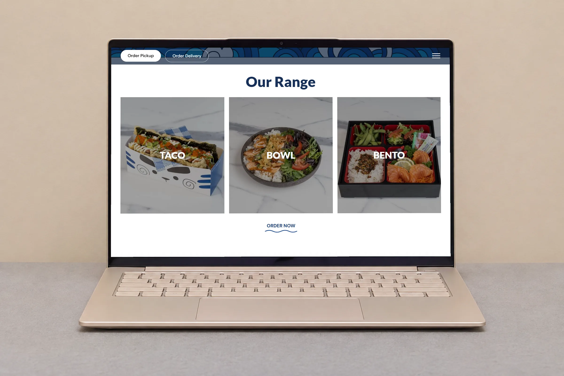
Mr O-Sushi grew out of a fusion sushi café and the Okamoto Fusion Sushi food truck. The site had to explain what a sushi taco is, show tacos, bowls and bentos at a glance, and keep pickup and delivery one tap away on every page.
Visit the site- Order Pickup and Order Delivery buttons at the top of every page
- A wave illustration that carries the brand down the page
- A catering page for group orders
Mr O-Sushi is a fusion sushi shop on Station Road in Cheltenham, Melbourne, serving sushi tacos, bowls and bentos that blend Australian, Japanese and American influences. It grew out of a fusion sushi café and the Okamoto Fusion Sushi food truck. We built a bold website for a sushi taco shop whose main job is simple: get a hungry visitor from the first screen to an order in one tap.
From a food truck to a shop on Station Road
The About page tells the story in one paragraph: a lifelong passion for sushi, a successful fusion sushi café, then the Okamoto Fusion Sushi food truck, and demand for bold, flavourful Japanese fusion food. Mr O-Sushi is where that idea lives now, open every day from midday into the evening.
Customers order in two ways. Some pick up from the shop, and others want their food delivered. The site had to serve both, explain a dish many people have never tried, and show the whole range at a glance.
Two order buttons before anything else
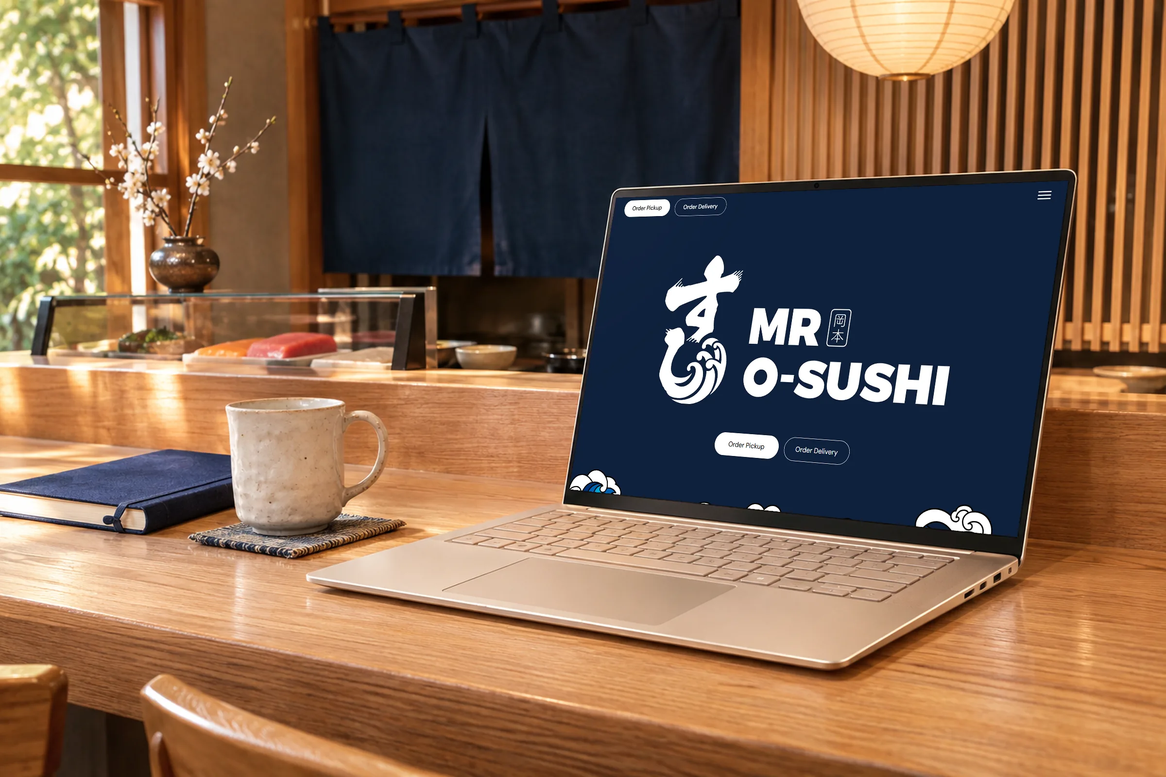
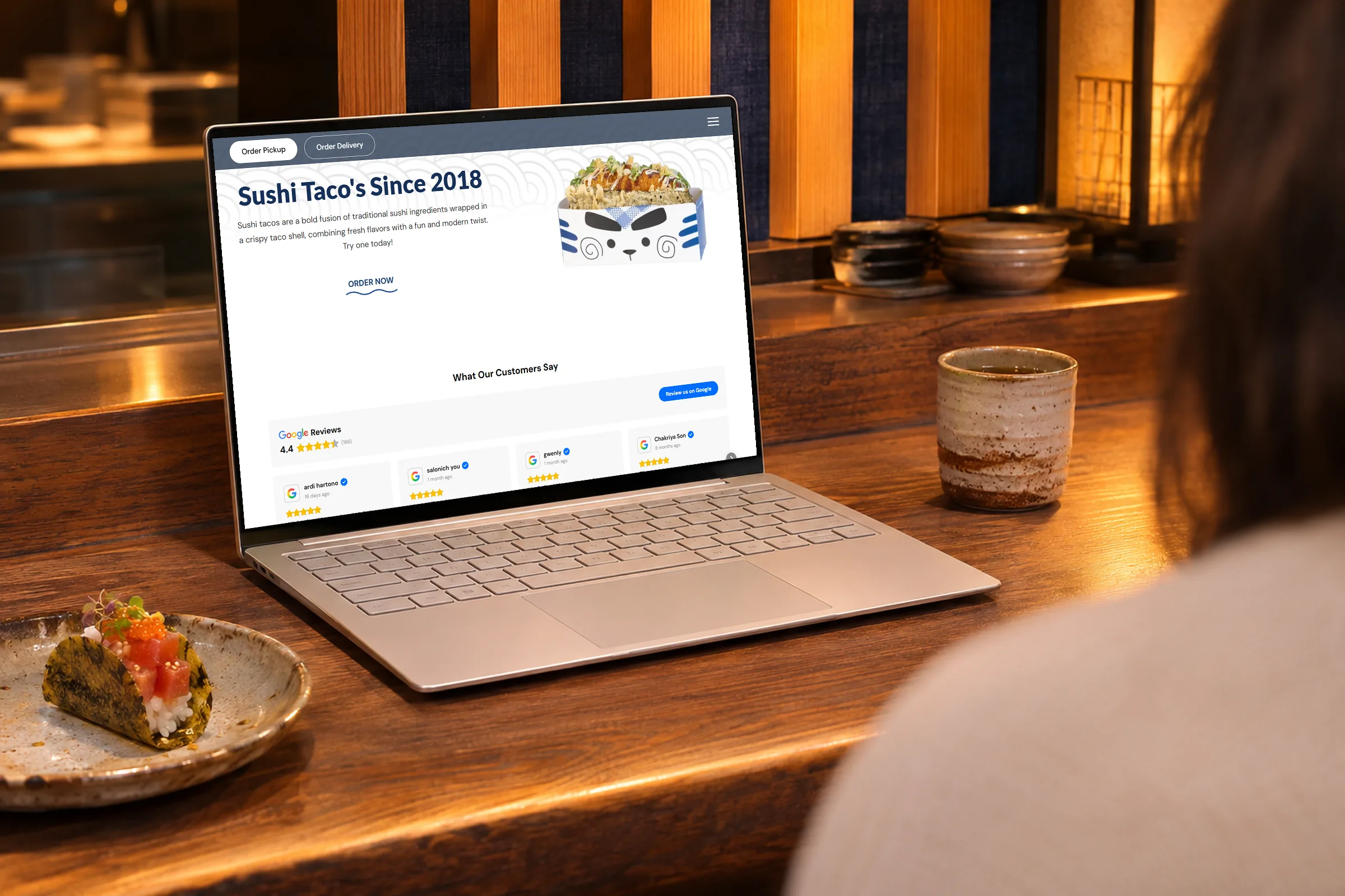
On a desktop, every page opens with two pill-shaped buttons in the top corner: Order Pickup, filled, and Order Delivery, outlined. Tucked inside each one is a cheeky second line, Right Now!!! and Yes Please, which rolls into view on hover. Order Pickup goes to the shop's own online ordering page in a new tab. On the home page, Order Delivery opens the shop's Uber Eats store, and the Order Delivery link in the menu does the same from any page.
The header stays fixed as you scroll, so the buttons never leave the screen. On a phone, the home page shows the same two buttons large and side by side right under the logo, where a thumb finds them first, and the menu carries Order Pickup, Order Delivery and Catering links as well.

Tacos, bowls and bentos in three tiles
The first section under the hero is Our Range: three large photo tiles labelled Taco, Bowl and Bento. Each tile links straight into its own section of the online ordering page, so someone who already knows they want a bowl is sent straight to the bowls section. An Order Now link with a wavy underline sits below the row.
Next comes the part every first-time customer needs. In two sentences, the page explains that a sushi taco is traditional sushi ingredients wrapped in a crispy taco shell, a fun and modern twist, and invites people to try one. Beside the text, a photo shows a sushi taco standing in its takeaway box, loaded with toppings, mayonnaise and spring onion. Seeing the dish does half the explaining.
Big waves, a chef cat and deep navy
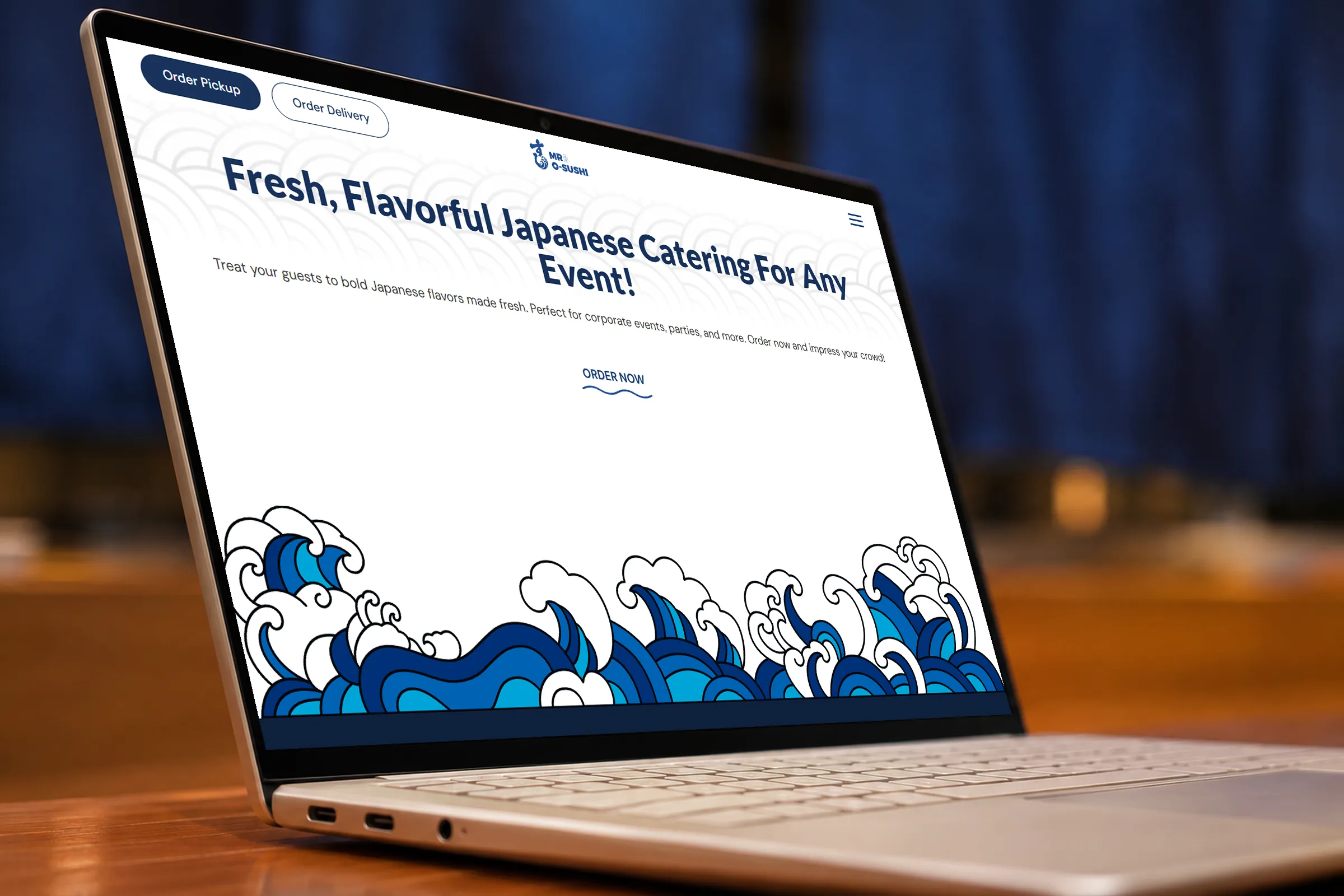
The look borrows from Japanese wave prints. The home page hero is deep navy with the logo in white: a brush-stroke character whose tail curls into a breaking wave, set beside Mr O-Sushi in heavy capitals and a small square seal. Along the bottom of the hero, a band of illustrated waves in blues and white crashes across the full width of the screen, and the same waves rise again above the navy footer.
In between, a fine pattern of overlapping wave arcs sits behind the sushi taco and catering sections, and links such as Order Now carry a wavy underline. The blues run from navy to a bright sky blue, and headings are set in solid navy type. The result is bold without being busy, which keeps the attention on the food photos.
The brand's cat character, wearing a chef's hat and holding up the logo, peeks over the corner of the big food photo on the About page, and its face is printed on the takeaway boxes in the photography. It adds a playful wink that suits a menu built on fusion.
Short, cheerful words and a clear contact page
The copy is short and upbeat. The About story fits in one paragraph, and a catering call-out on the same page offers fresh Japanese catering for corporate events and parties, with an Order Now link. Page titles name what people search for, such as fusion sushi tacos, bowls and bentos, and the Cheltenham address sits in the footer with a link to the shop's Google listing, next to the opening hours.
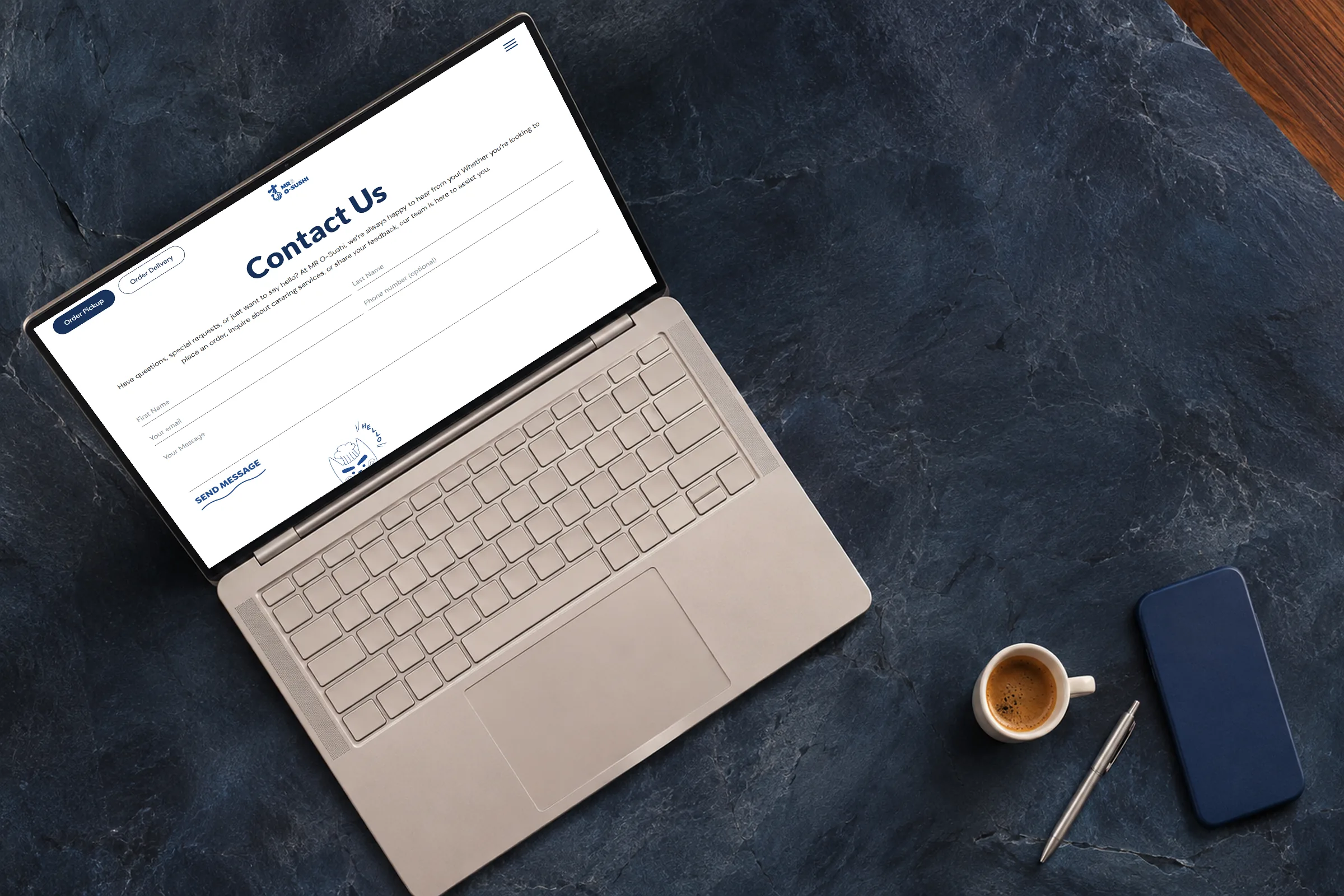
The Contact page invites orders, catering questions and feedback through a short form, where the phone number is optional. Trading hours are listed day by day beside the address and email. On the home page, customer reviews sit under a Google Reviews panel with a button that invites diners to leave their own.
A lesson for takeaway shops
For a takeaway shop or a small restaurant website, the job is to remove steps. Put pickup and delivery above everything else, and link each part of the range straight into the matching section of the ordering page.
When a dish is new to most people, explain it in two plain sentences next to a photo and an order button. Curiosity turns into an order while it is still fresh.
Project summary
Want a site
like this one?
Start with a free 20-minute diagnostic. We look at your current site and tell you what we would change first.