An online grocery store for a Latin food market
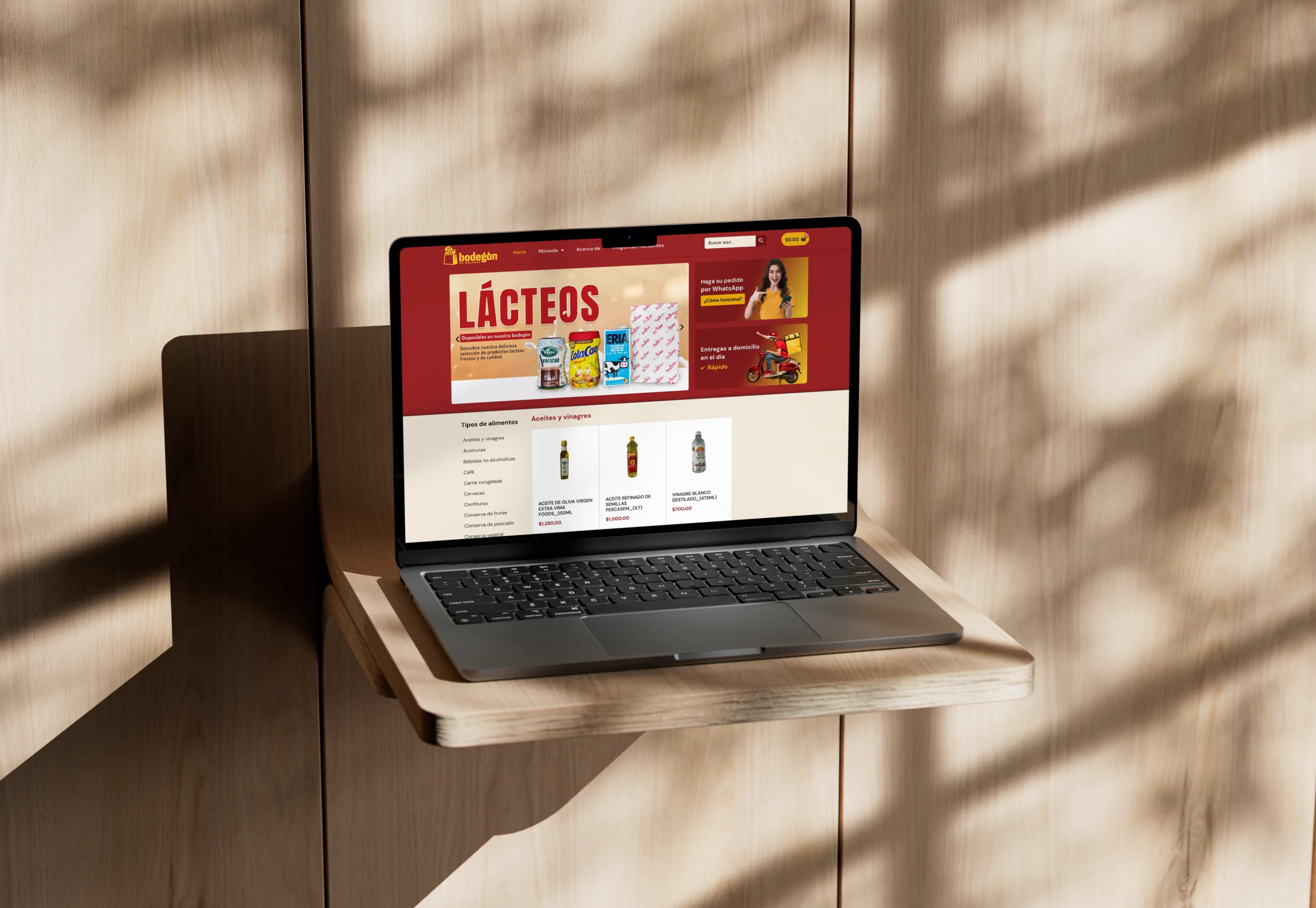
Customers could only order by phone or in person, and the team spent hours confirming orders by hand.
- Online store with product categories and a simple cart
- Ordering by WhatsApp and same-day delivery
- Product photography and catalog setup
Bodegón de Dolores is a food store on Calle Dolores in Havana, selling groceries, drinks, household goods and sweets. Before this project, customers could only order by phone or in person, and the team spent hours confirming orders by hand. Over six weeks we built an online grocery store where people browse by category, fill a simple cart and send the order to the store on WhatsApp.
From coffee and beans to cleaning supplies
The shelves cover a lot of ground. Food alone is split into oils and vinegars, coffee, meats, cured and smoked meats, grains, dairy and dairy alternatives, canned goods, spices, sauces, ready-to-cook items, soft drinks, beer and other alcoholic drinks. Next to it sit personal care, household cleaning, a bakery and sweets section, and cigarettes and vapes.
The store is open every day and delivers to every municipality in Havana. Its copy also speaks to people shopping for someone else, with food arriving at a relative's door, and the FAQ adds separate notes for customers who live in Cuba. So the site serves two kinds of shopper: neighbors buying for their own homes, and family members ordering from farther away.
Categories first, so the catalog is easy to walk
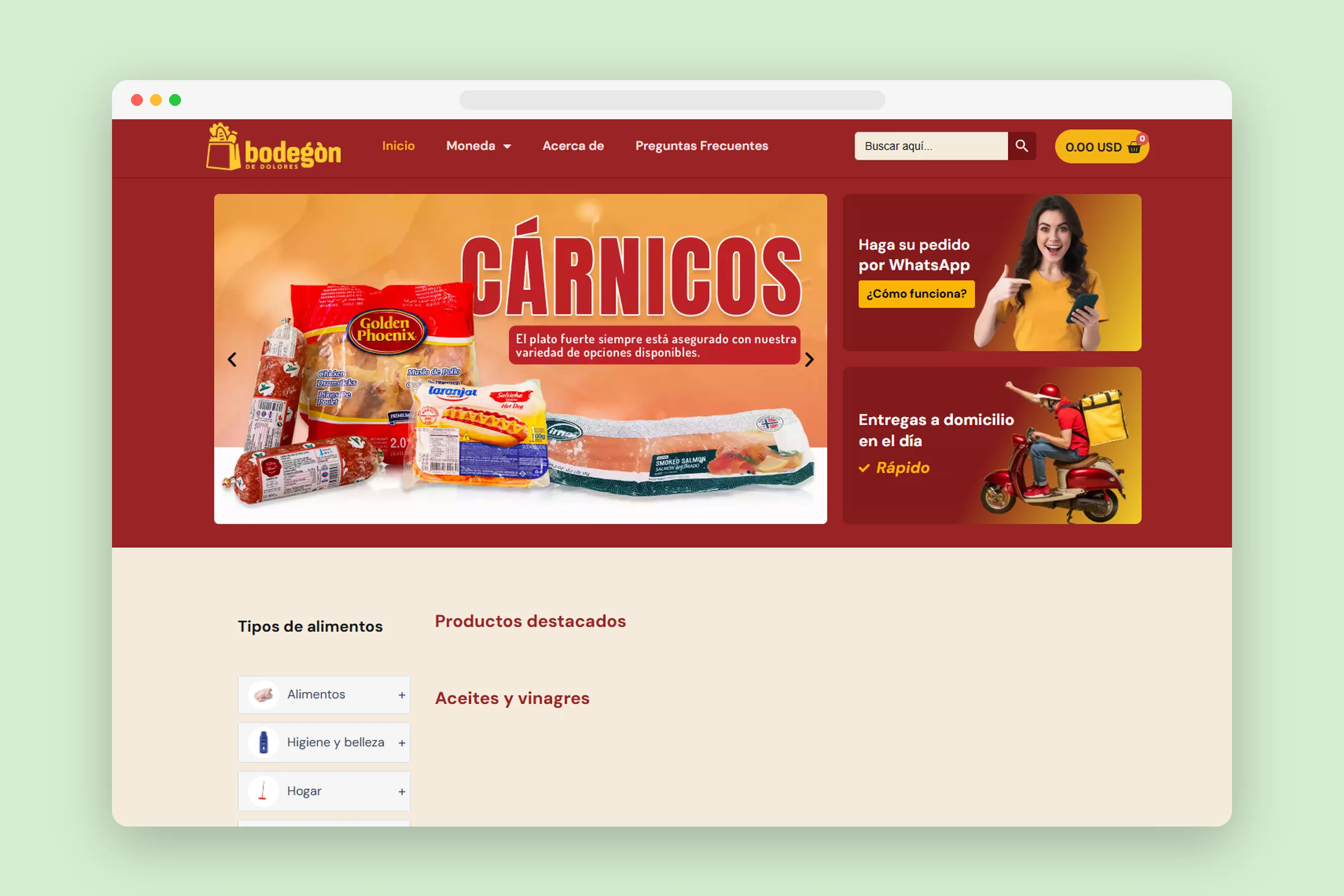
We organized the catalog the way people already think about a trip to the store. A Tipos de alimentos section on the home page lists every department with its subcategories. Below it, the page runs through featured products and then a row for each category, from oils and vinegars all the way to cigarettes. At the top, a large banner slider rotates through departments such as dairy, cleaning products, sweets and meats.
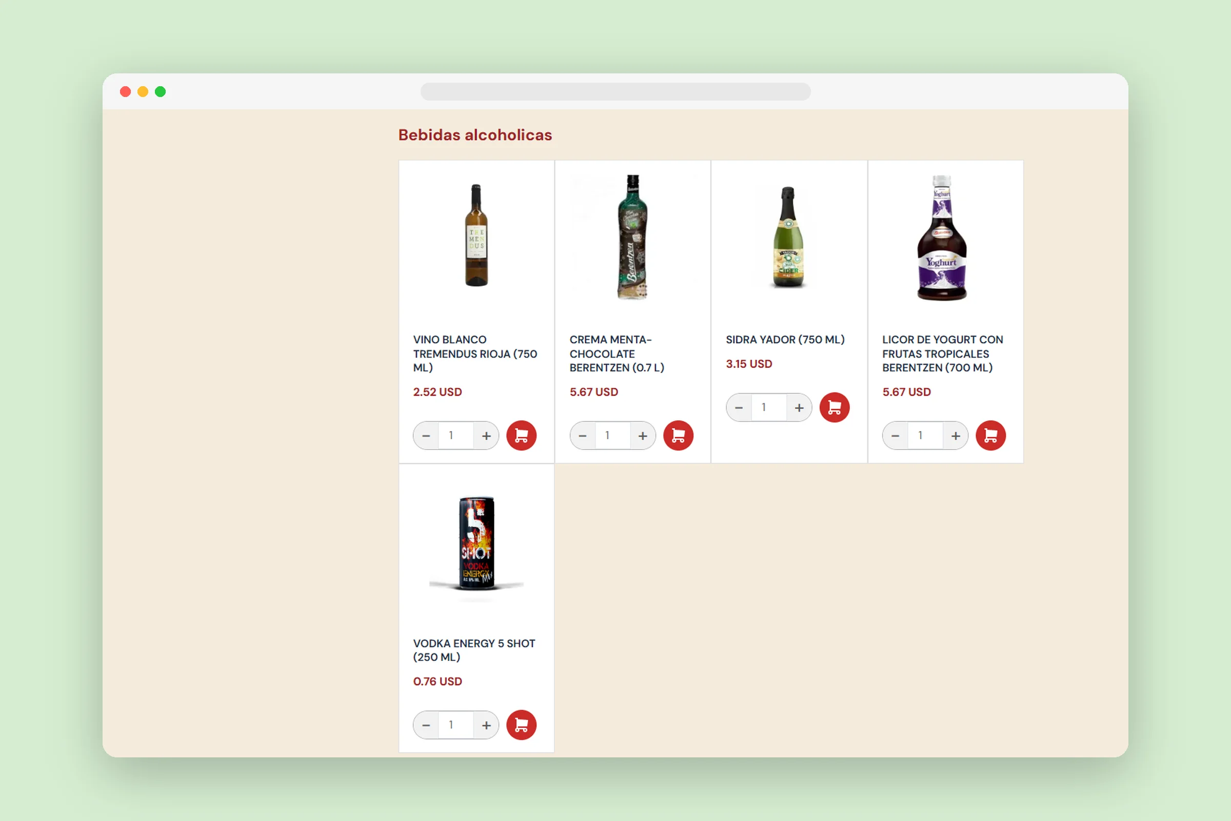
Each category page works like an aisle. Every product has a photo, a name that includes the pack size and an add to cart button, and shoppers can filter the list or sort it by popularity, rating, newest or price. The colors come from the brand: a deep red, the store's warm yellow logo and a soft cream, so the store looks like a local shop and not a generic marketplace.
A checkout that ends in a WhatsApp chat
The biggest change is how orders reach the team. The store uses WhatsApp for help, for a customer group and for order confirmations, so the checkout offers a payment method called Ordenar por WhatsApp.
The home page explains the whole process in four short steps under the heading Simple y Rápido:
- Pick a product and add it to the cart, as many times as you like.
- Keep shopping, or open the cart to place the order.
- Choose Ordenar por WhatsApp as the payment method.
- Confirm, and you are taken straight to the store's WhatsApp chat with your order.
The order reaches the team as a WhatsApp chat they can answer, so nobody has to take it down item by item during a phone call. Same-day delivery sits right beside it: a tile next to the main banner announces home delivery on the same day, and another invites people to order by WhatsApp and see how it works.
Made for shopping on a phone
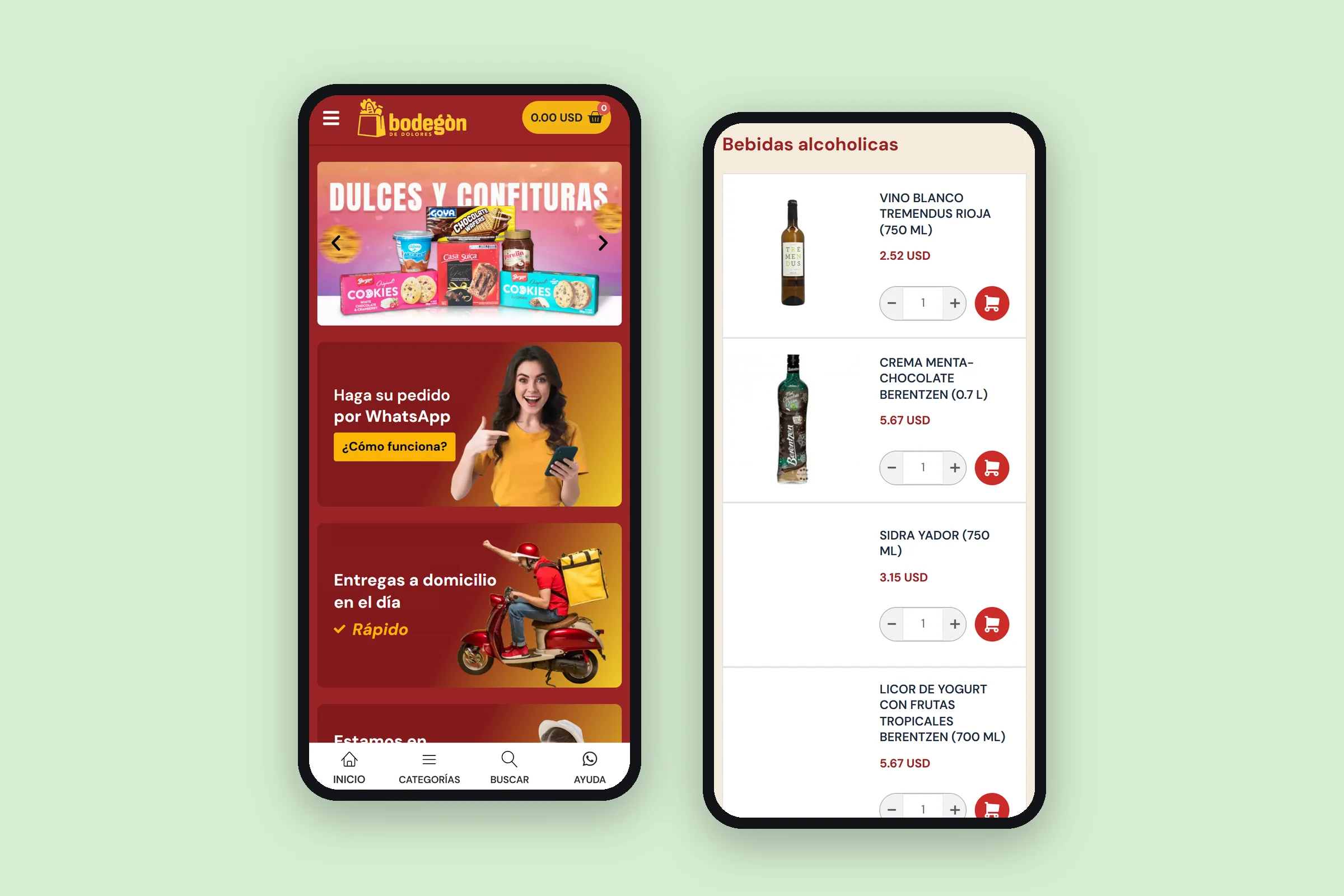
On a phone, the store gets its own navigation. A bar fixed to the bottom of the screen holds four buttons: Home, Categories, Search and Help, and Help opens a WhatsApp chat with the store. On a computer, the header stays at the top as you scroll, so the search box and the cart are always in reach.
A currency switcher in the menu shows prices in Cuban pesos, US dollars, euros or MLC. For a store whose customers do not all live in Cuba, that small control lets each shopper see prices in a currency they know.
Photos that match what arrives
We also took care of the product photography and set up the catalog. In a grocery store, a photo has a practical job: it shows the exact brand and size. One FAQ answer makes that a promise, saying the product a customer receives is exactly the one in the picture.
The rest of the FAQ covers the questions a customer would otherwise call to ask: how to buy, whether it is safe, how confirmation works, how to cancel before an order is confirmed, what happens if something arrives damaged and whether delivery reaches all of Havana. The answers are short and written in everyday Spanish.
Let the conversation close the sale
An online grocery store for a neighborhood shop does not need to copy a supermarket checkout. It needs to fit the way the store works. Here that meant a clear catalog, a cart anyone can use and an order that lands in a chat where the team can answer and confirm it.
If your customers would rather talk to you than fill in forms, build the site around a conversation. Let the website handle the browsing, the photos and the common questions, and let the final step happen in a chat.
Project summary
“Algenib Agency did an exceptional job designing our website for Bodegón de Dolores. They were attentive to our needs and preferences, and the final product was not only visually stunning but also user-friendly. Our customers love the new website, and it has significantly improved our online presence.”
Want a site
like this one?
Start with a free 20-minute diagnostic. We look at your current site and tell you what we would change first.